

Bangalore International Airport (Terminal 2) | 2200 square feet
BRIEF:
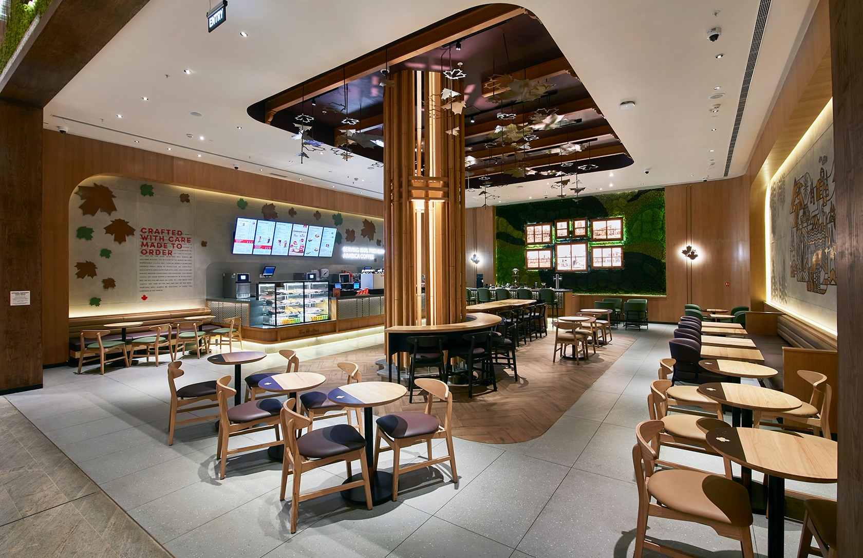
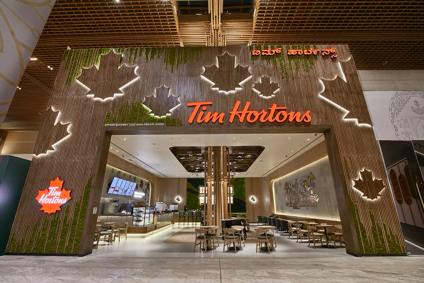
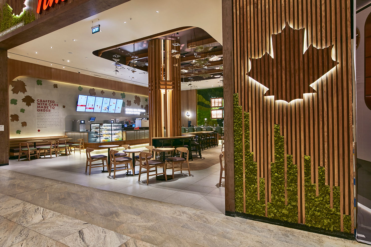
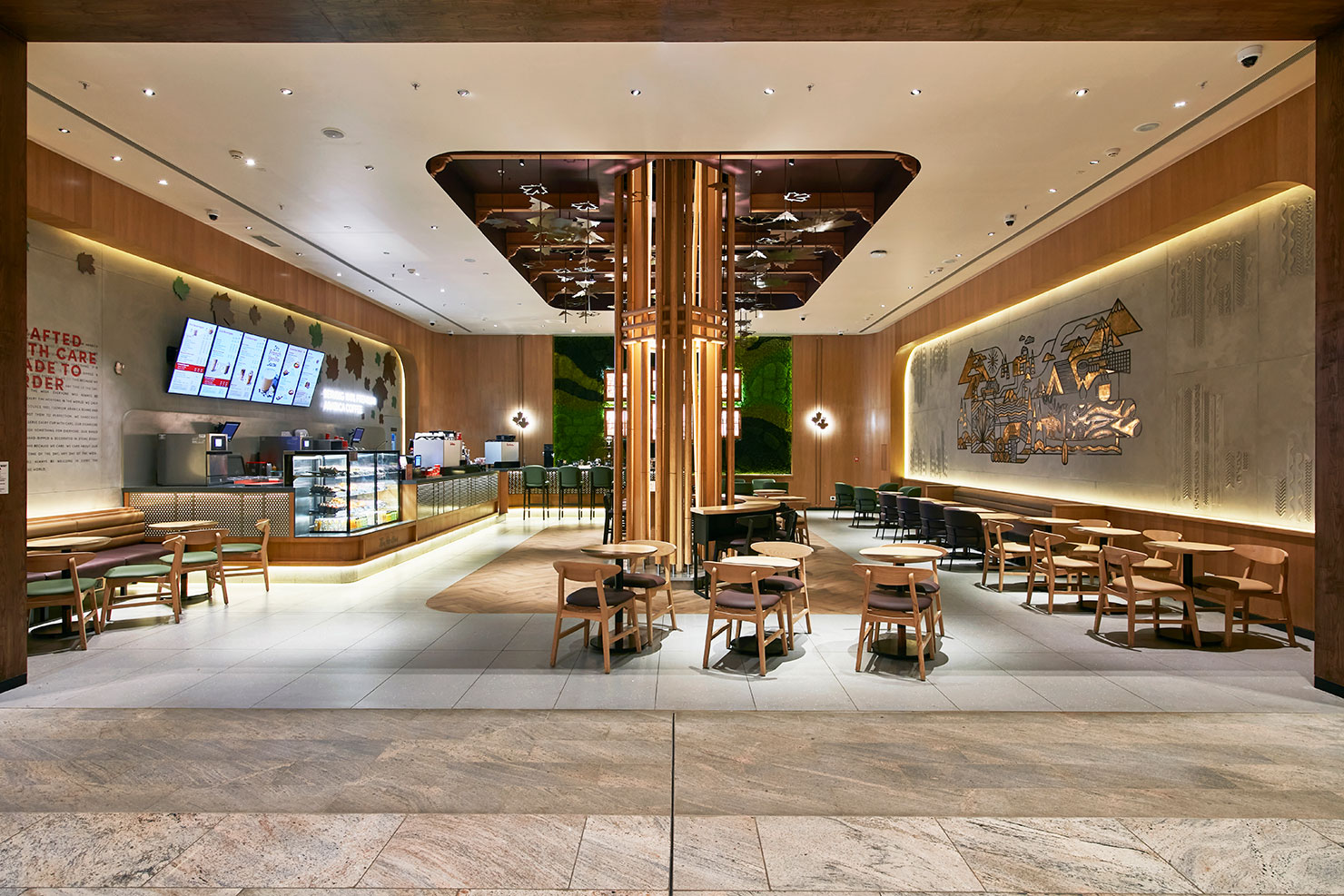
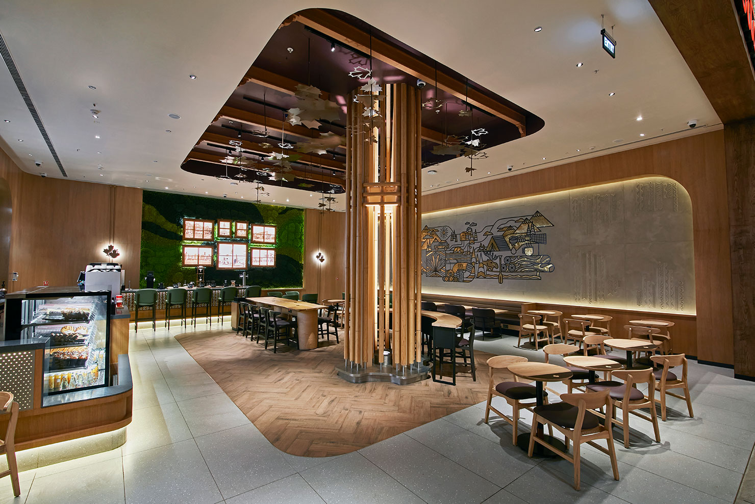
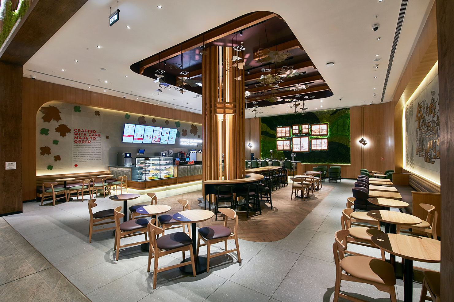
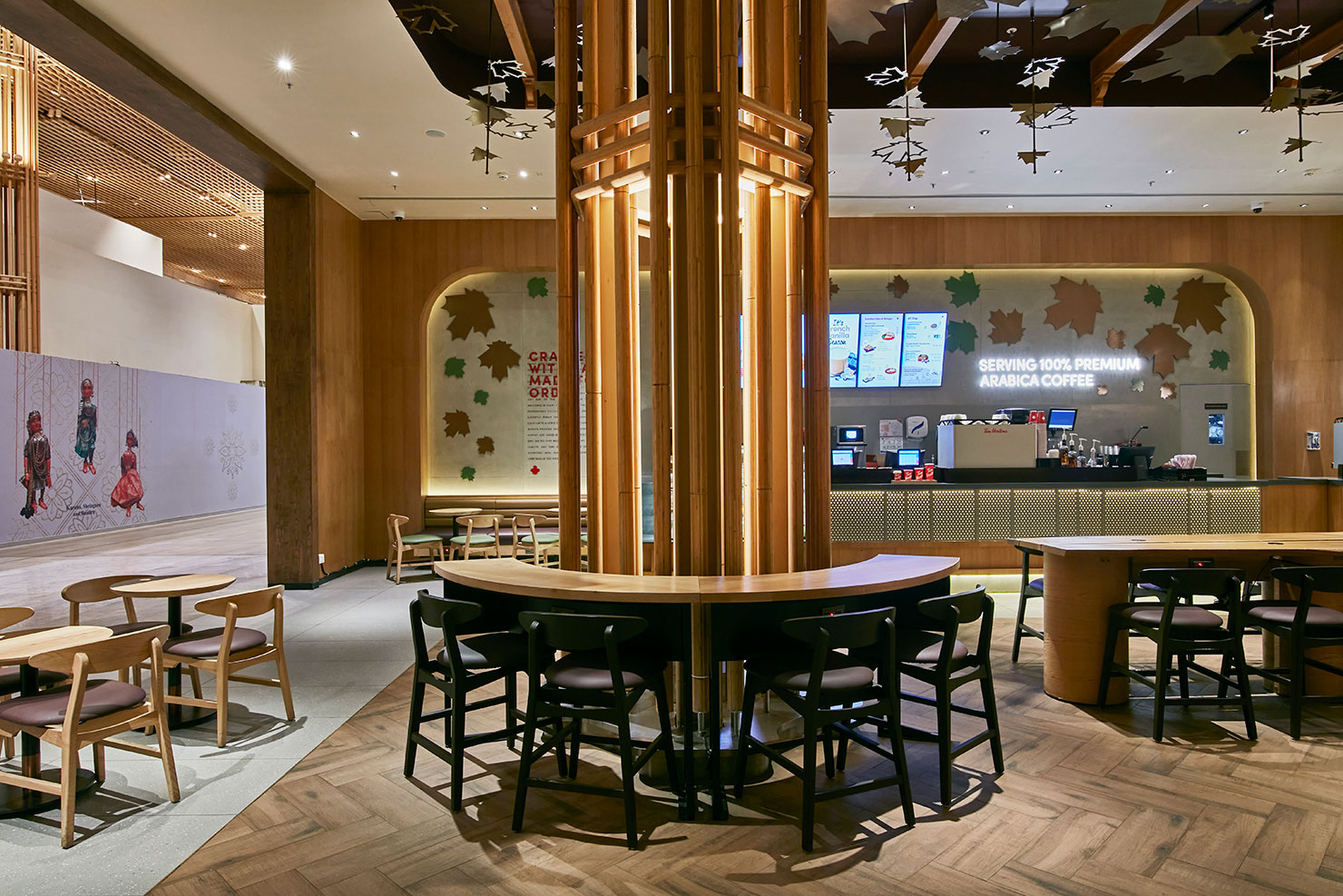
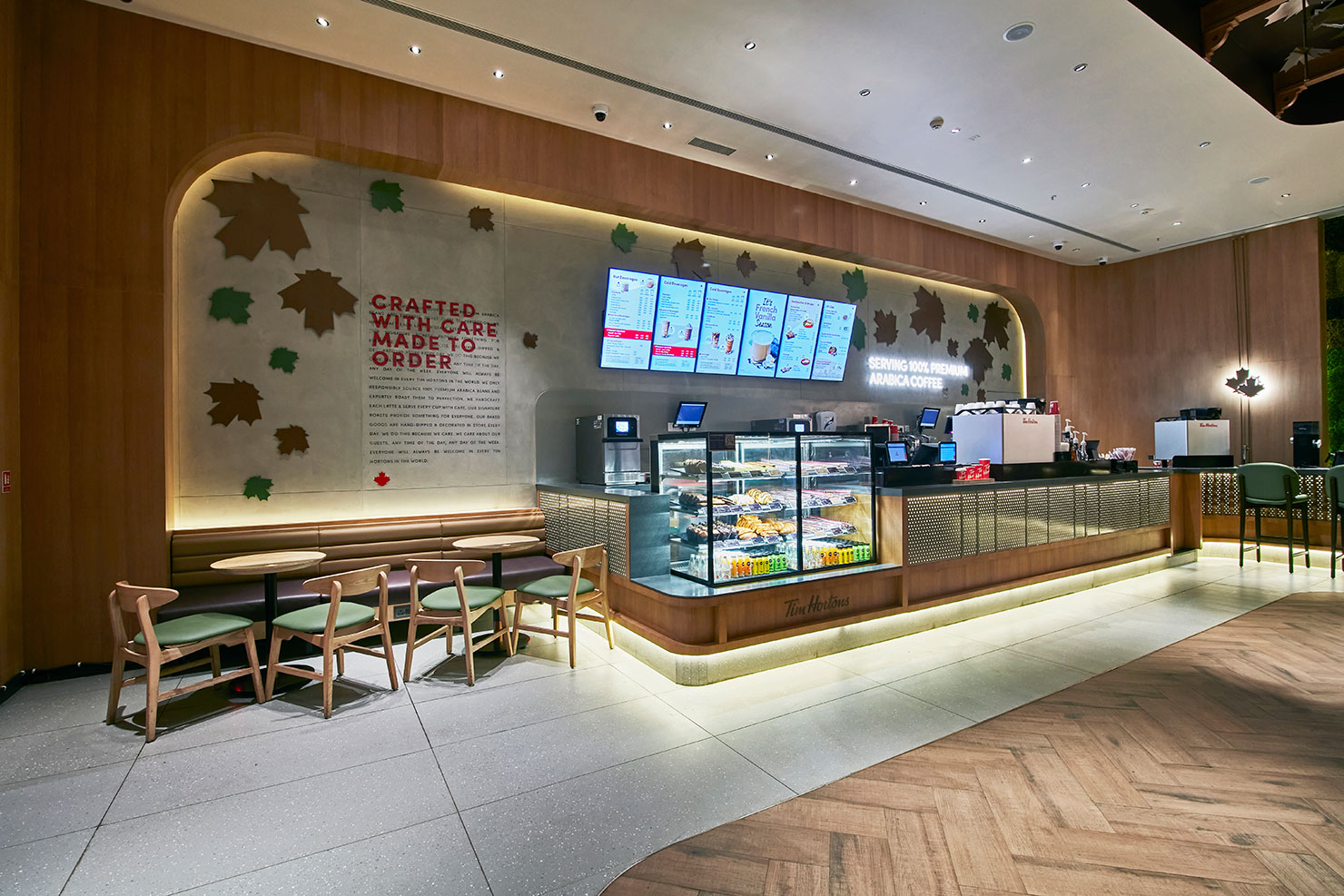
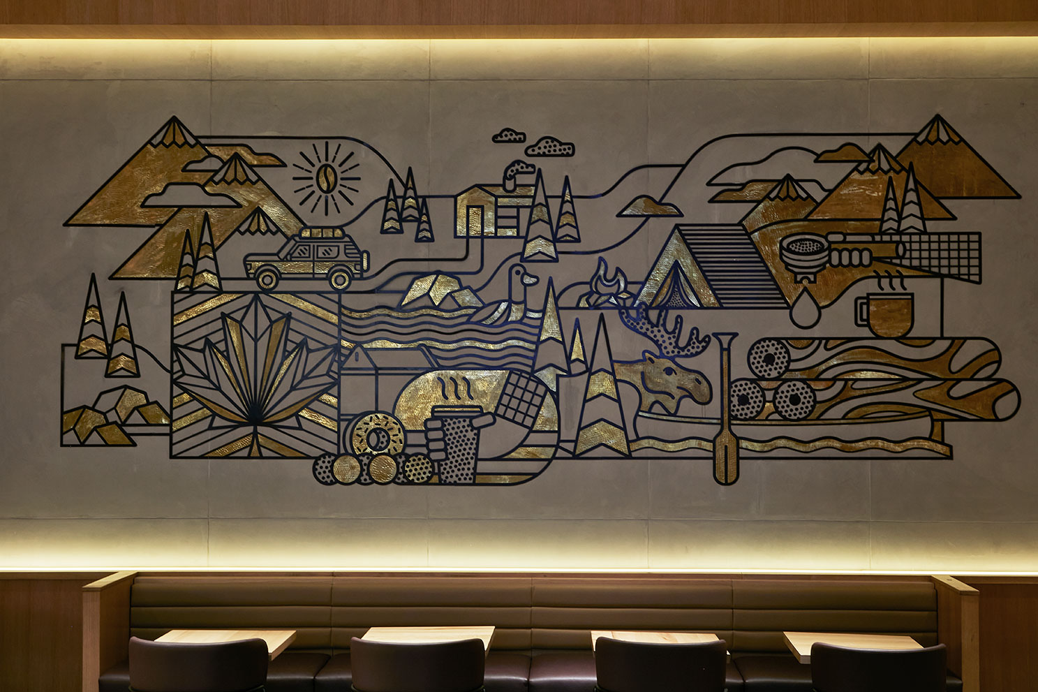
The store concept is meant to be an ode to Bangalore’s moniker as the “Garden City” and was to be designed and built to encapsulates the essence of sustainability, local heritage, and environmental consciousness.
CONCEPT:
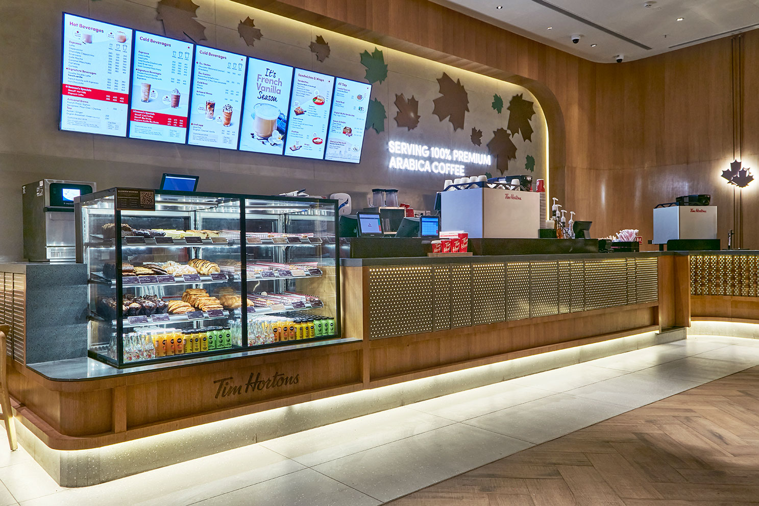
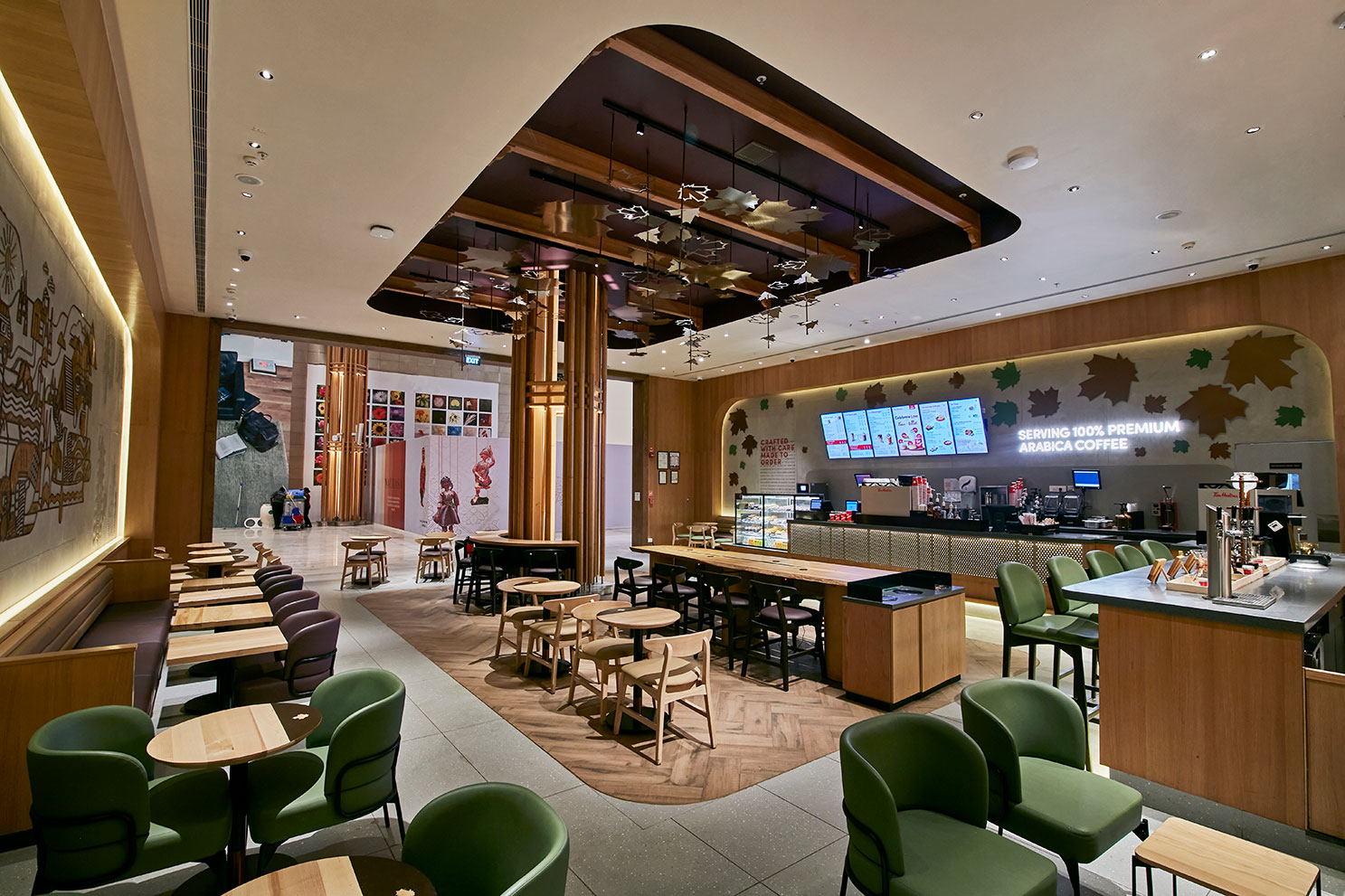
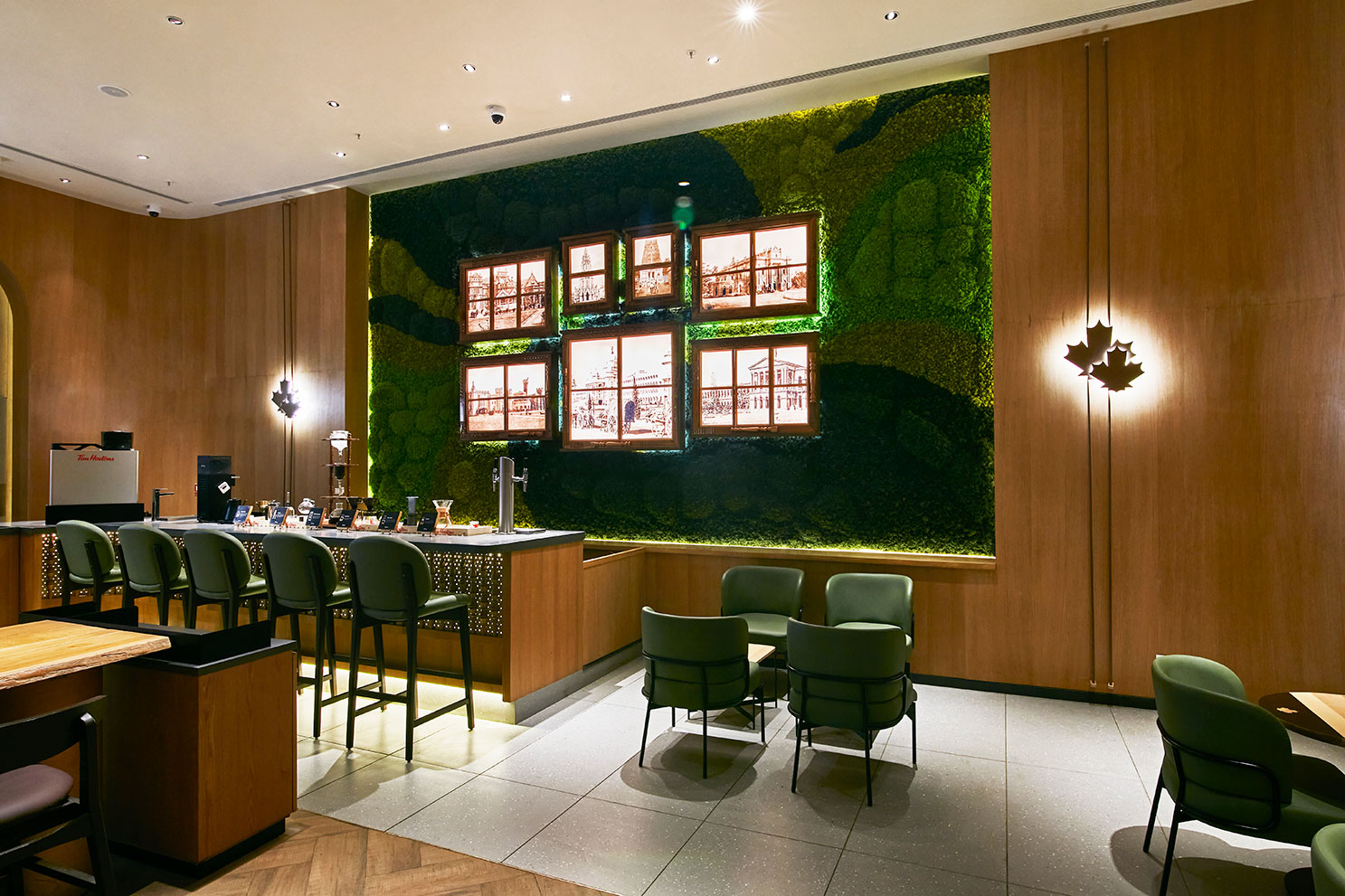
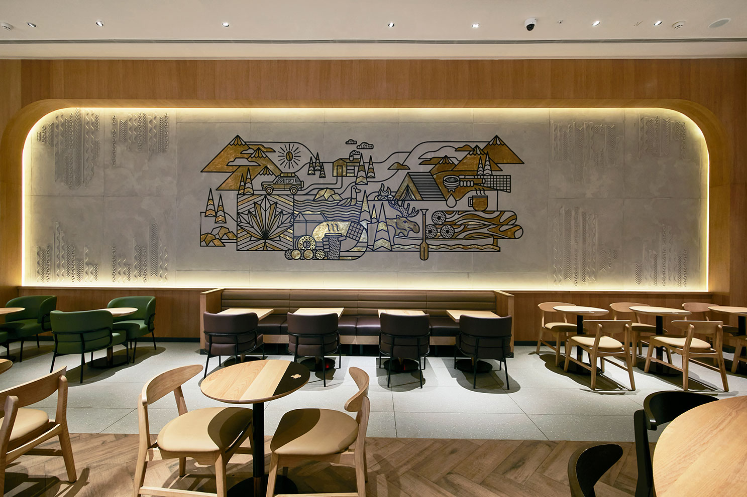
The design concept seamlessly blends elements of the city’s lush greenery with sustainable design principles. Real moss and intricate woodwork are incorporated to create a captivating ambiance that reflects the city’s charm. The open and inviting facade is a combination of wooden rafter and real moss integrated in it. Edge lit branding and the brand’s signature maple leaf form helps add a vibrant touch to the brand’s unique signature. The use of natural elements fosters a connection with the outdoors while promoting indoor air quality and biophilic design principles. Interior elements are layered with cues from the city’s culture and heritage in terms of forms and finishes. Local craftsmen were enlisted to create hand-carved windows, lathe work and beaten brass inspired by the city’s old-world charm and reflect the city’s rich heritage. Cutting-edge green technologies, such as energy-efficient lighting fixtures and water-saving plumbing systems, to minimize resource consumption and reduce carbon emissions and enables it be compliant with Bengaluru airport’s Terminal 2’s prestigious IGBC platinum certification.