THE BRIEF:
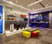
The core brief for the environment design was ‘to create a minimalistic and scalable design which is memorable and delivers a memorable consultative experience of their smart lifestyle product portfolio. 4Dimensions was commissioned to create the new store design and presentation scheme and assist in project managing the design realization of the same.
THE CONCEPT:
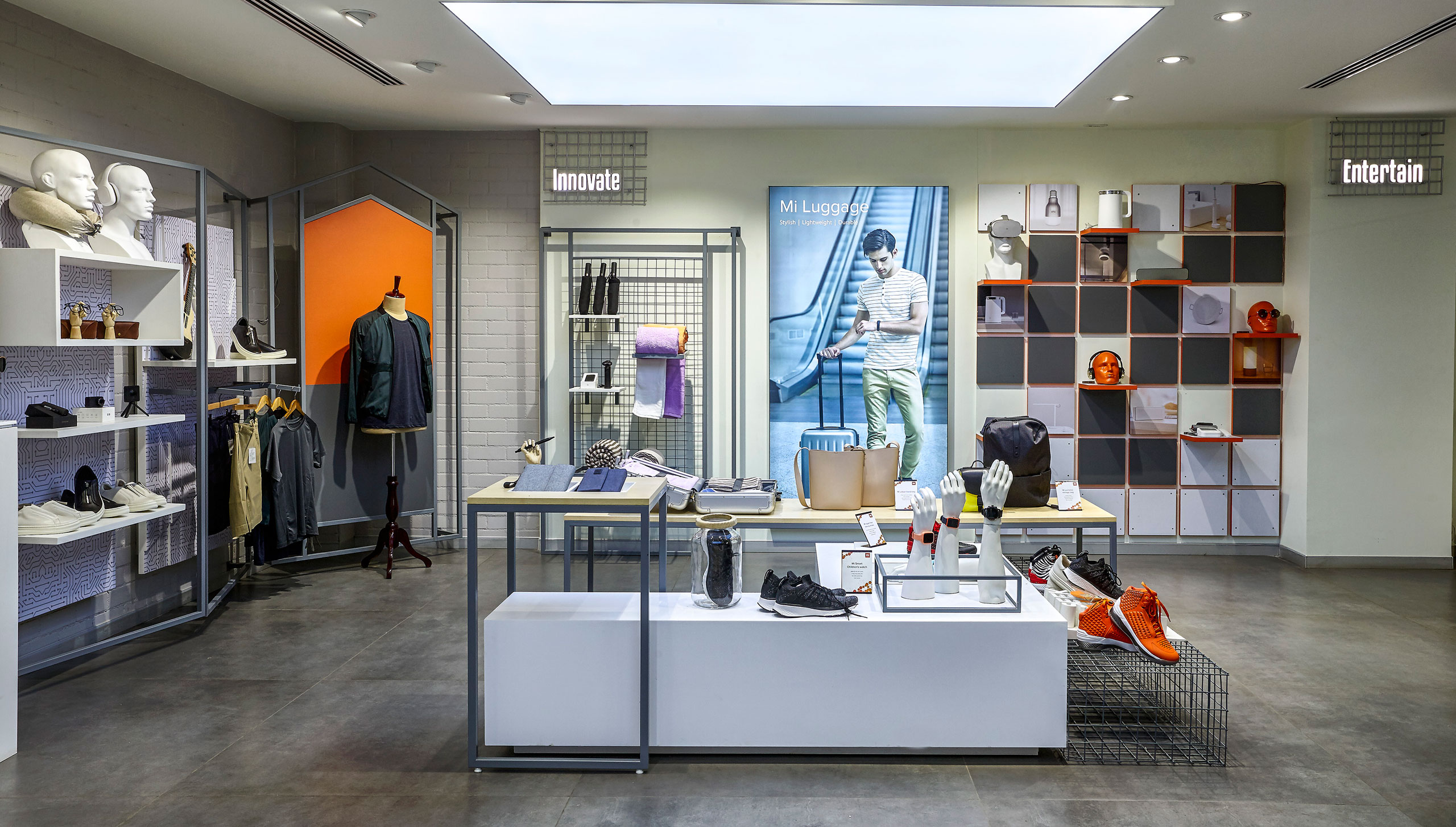
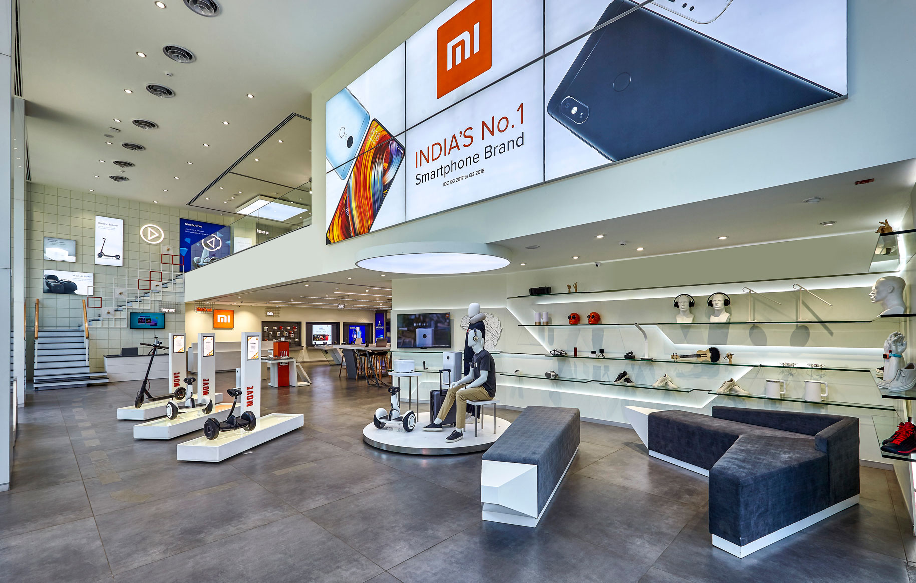
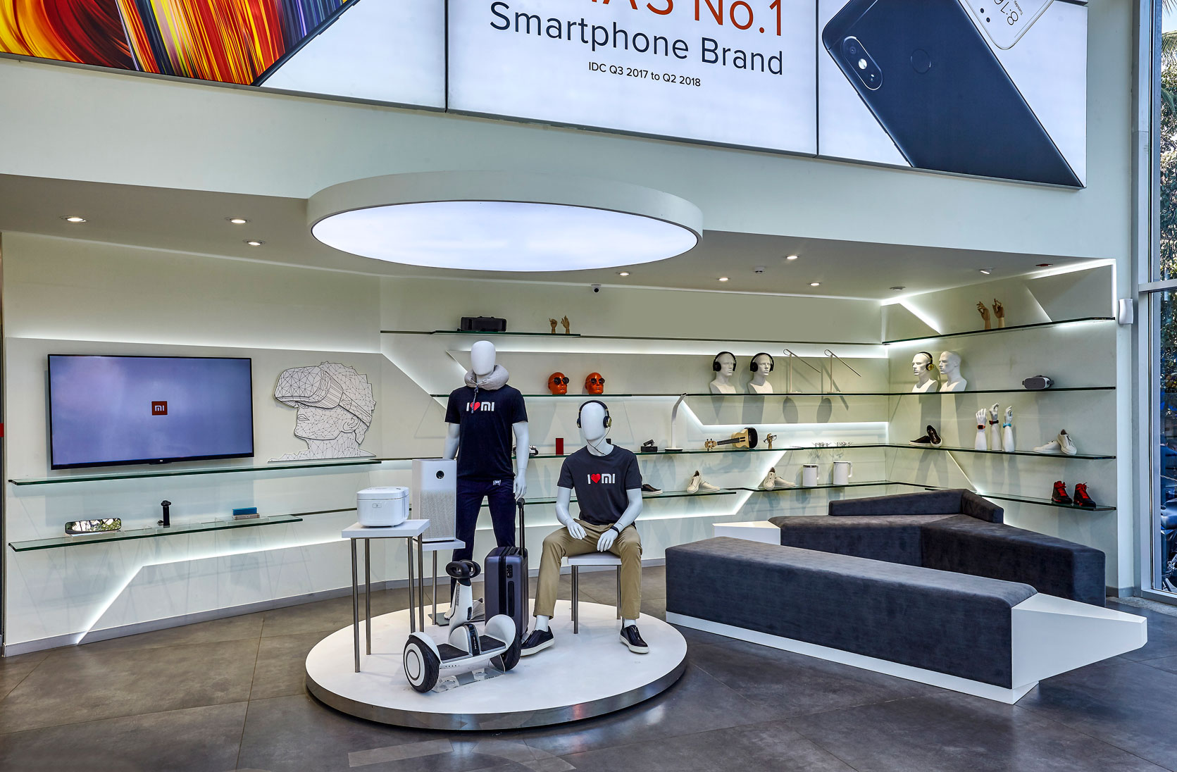
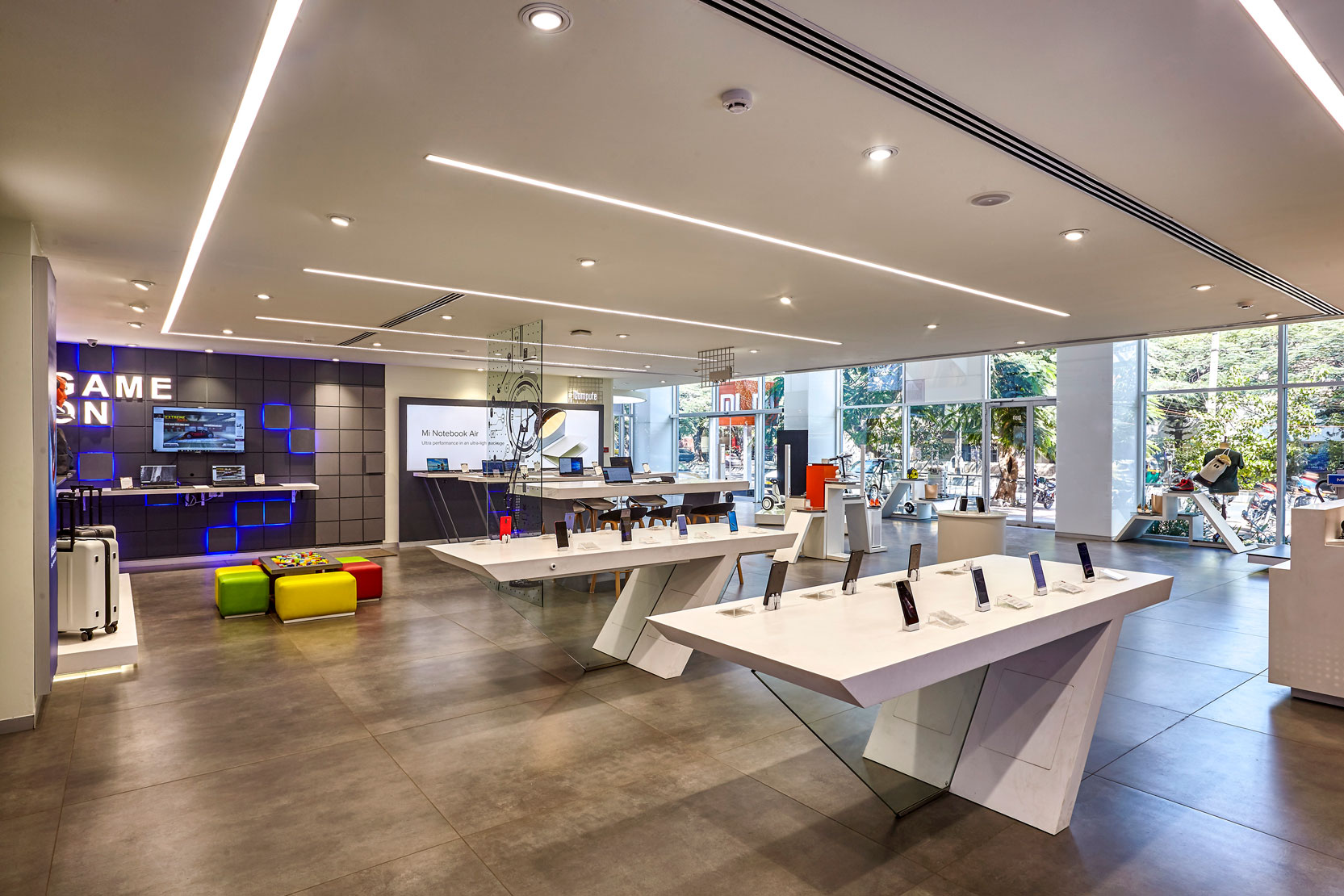
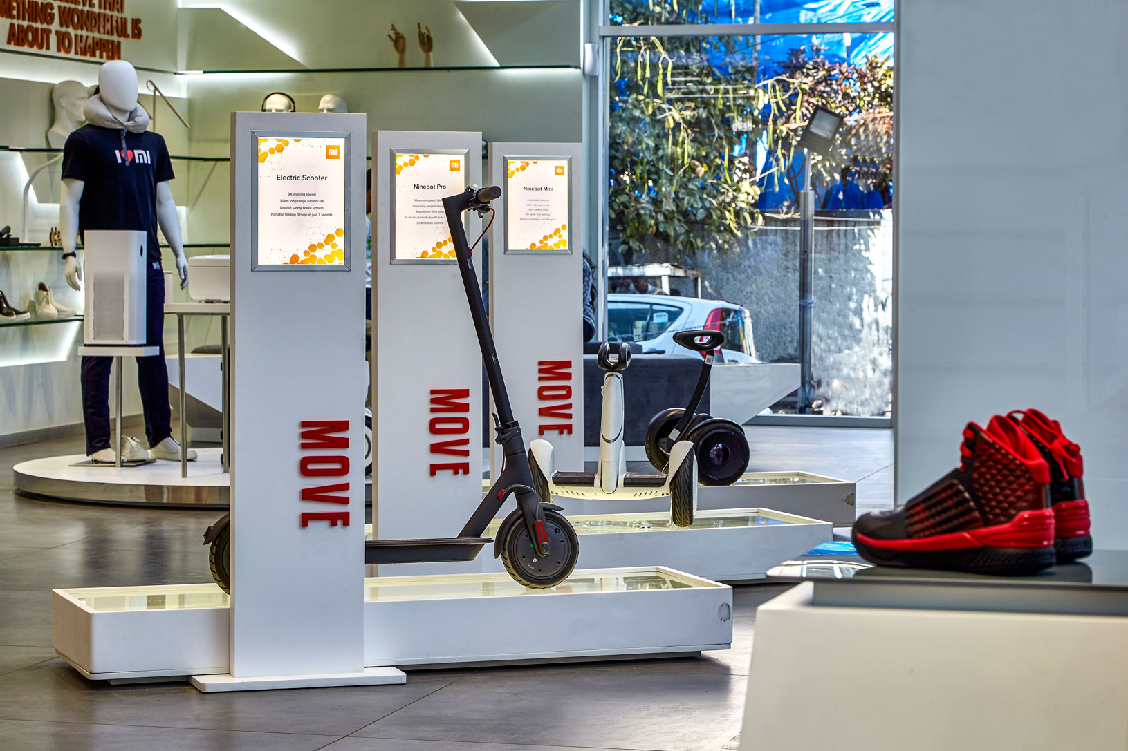
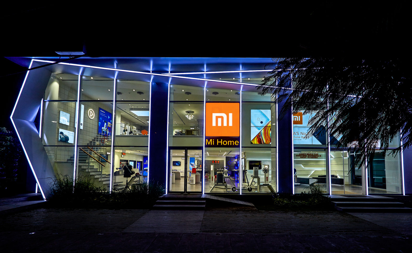
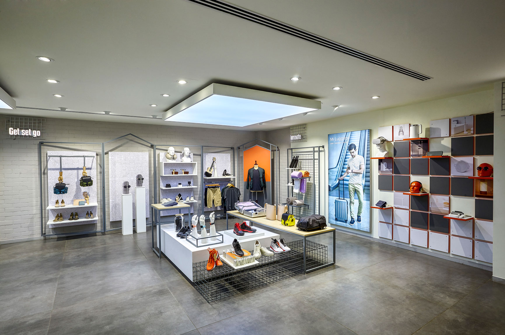
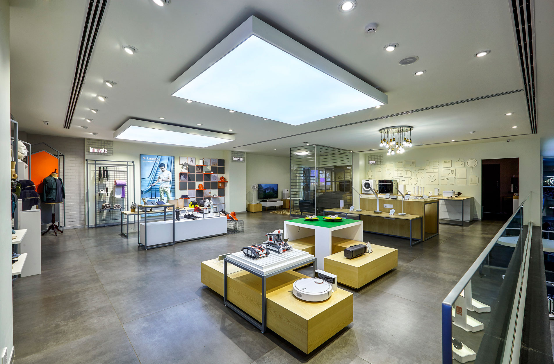
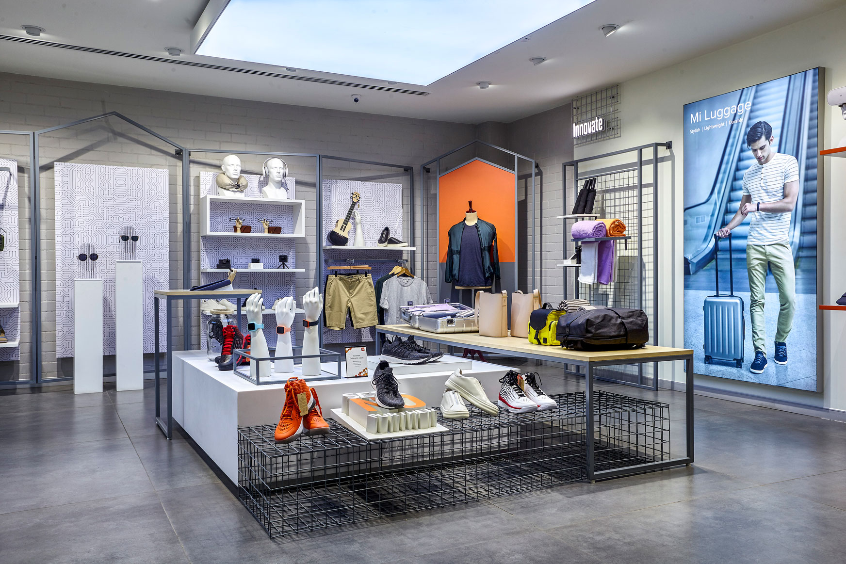
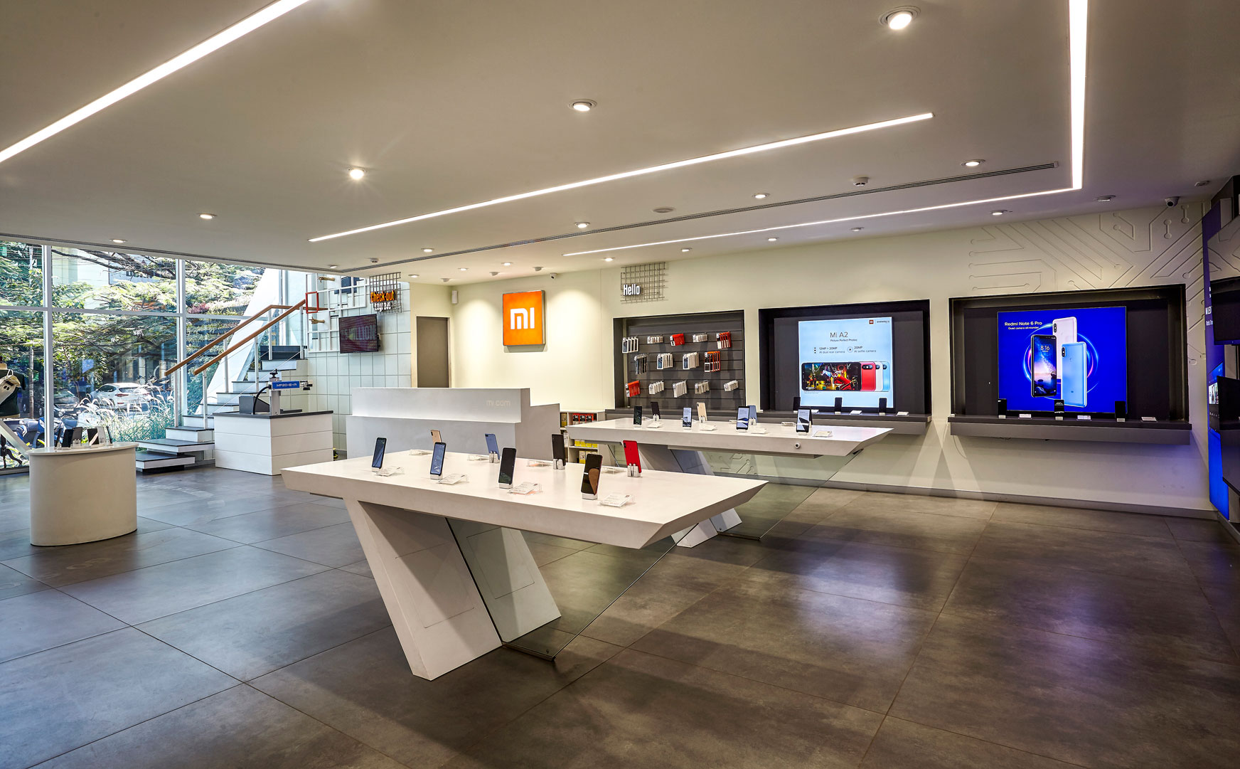
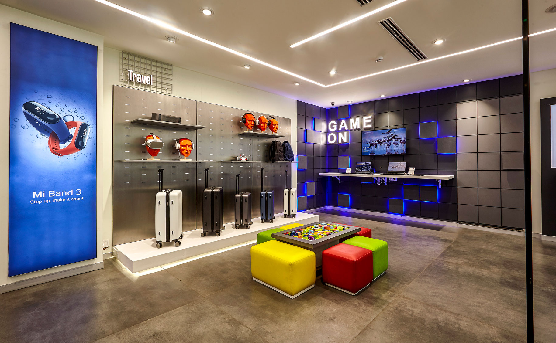
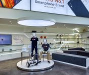
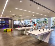
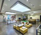
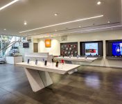
The design strategy was to create a smart warm consultative tech environment that was experiential and enjoyable for the tech discerning consumer. The signature design was delivered using a contemporary color palette of grey and white with MI orange and oakwood highlights rendered in a combination of clean metal, wood and corian.The core offerings showcased in the store are segmented category zones and each of these category zones are designed to allow for inspirational presentation, demonstration and experience of the smart IoT features of every product that is controlled from a MI phone.The store design strategy was to create a ‘consultative tech gallery’ for seamlessly introducing every product to the prospecting consumer, defined by the brand as the first-time jobbers or college grad tech enthusiast. The store design lines are clean and youthful with phy-gital messaging and storytelling to educate visitors on the usage and benefits of every smart device presented in the store. The circulation, forms and furniture design in the store help curate a planned journey across the smart gallery like store. Boutique lighting design help draw focussed attention to the key features of the products and the environment.Overall, the store experience is a delightful journey of discoveries of new possibilities of MI’s modern smart lifestyle.


