THE BRIEF:
The brief was to create a differentiated QSR experience in a space with an identity that is in sync with their mother brand of CureFit.
THE CONCEPT:
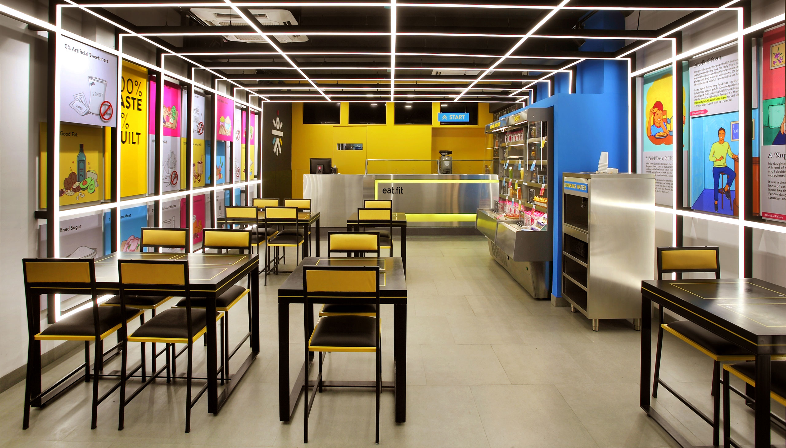
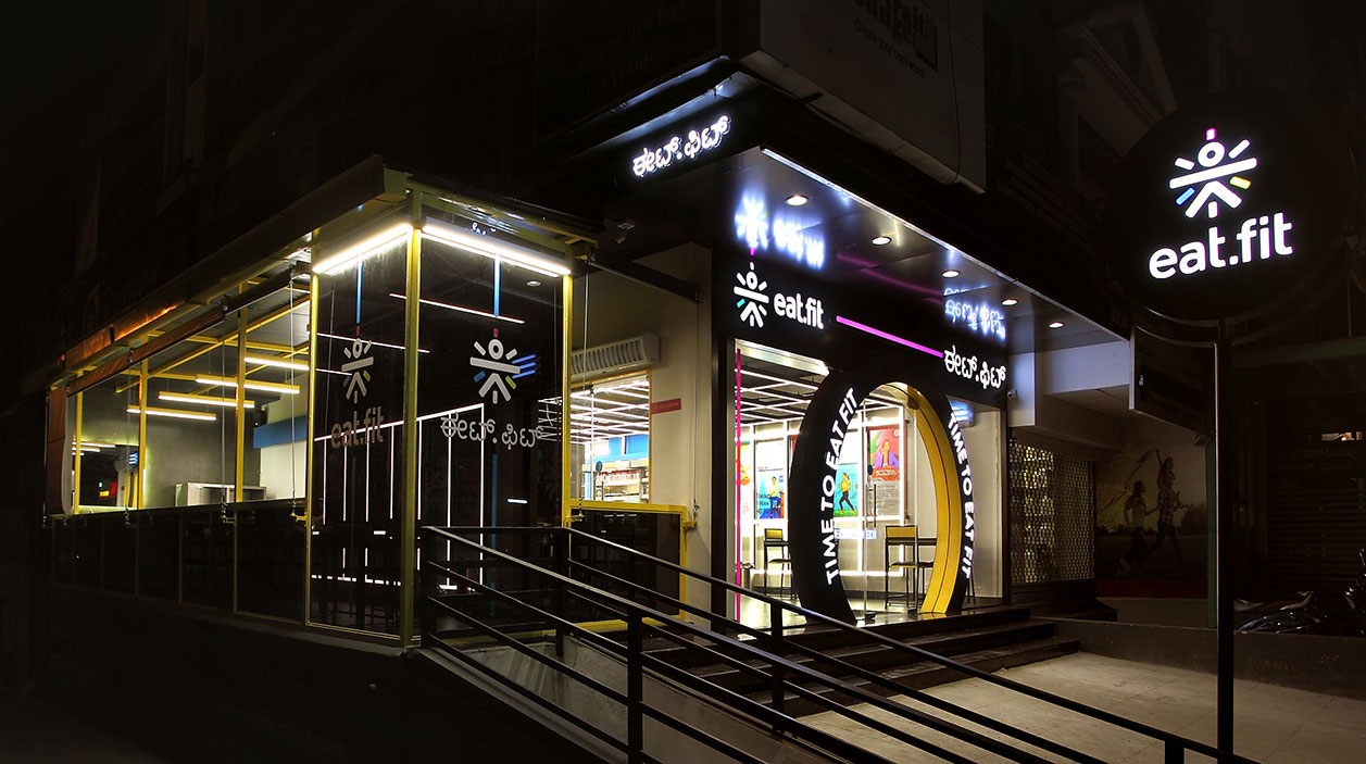
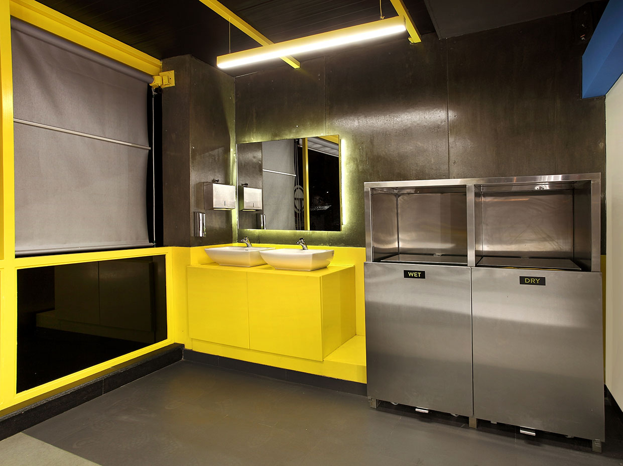
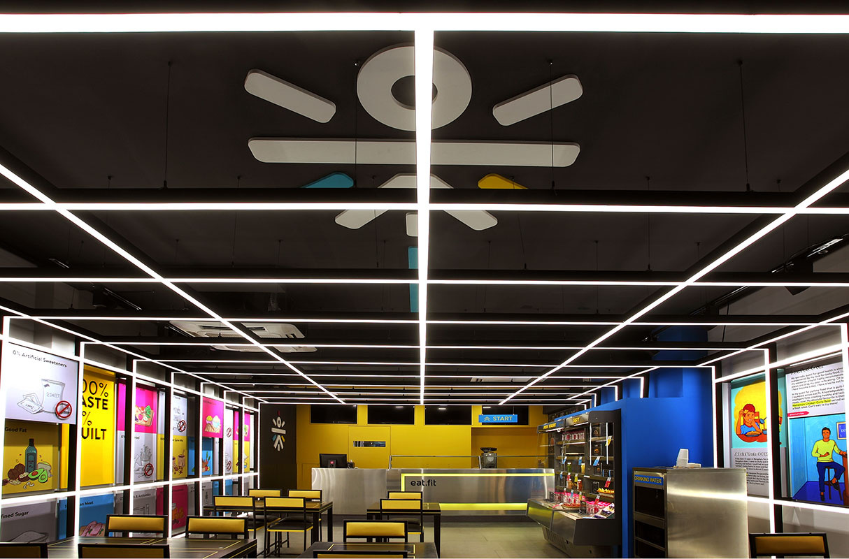
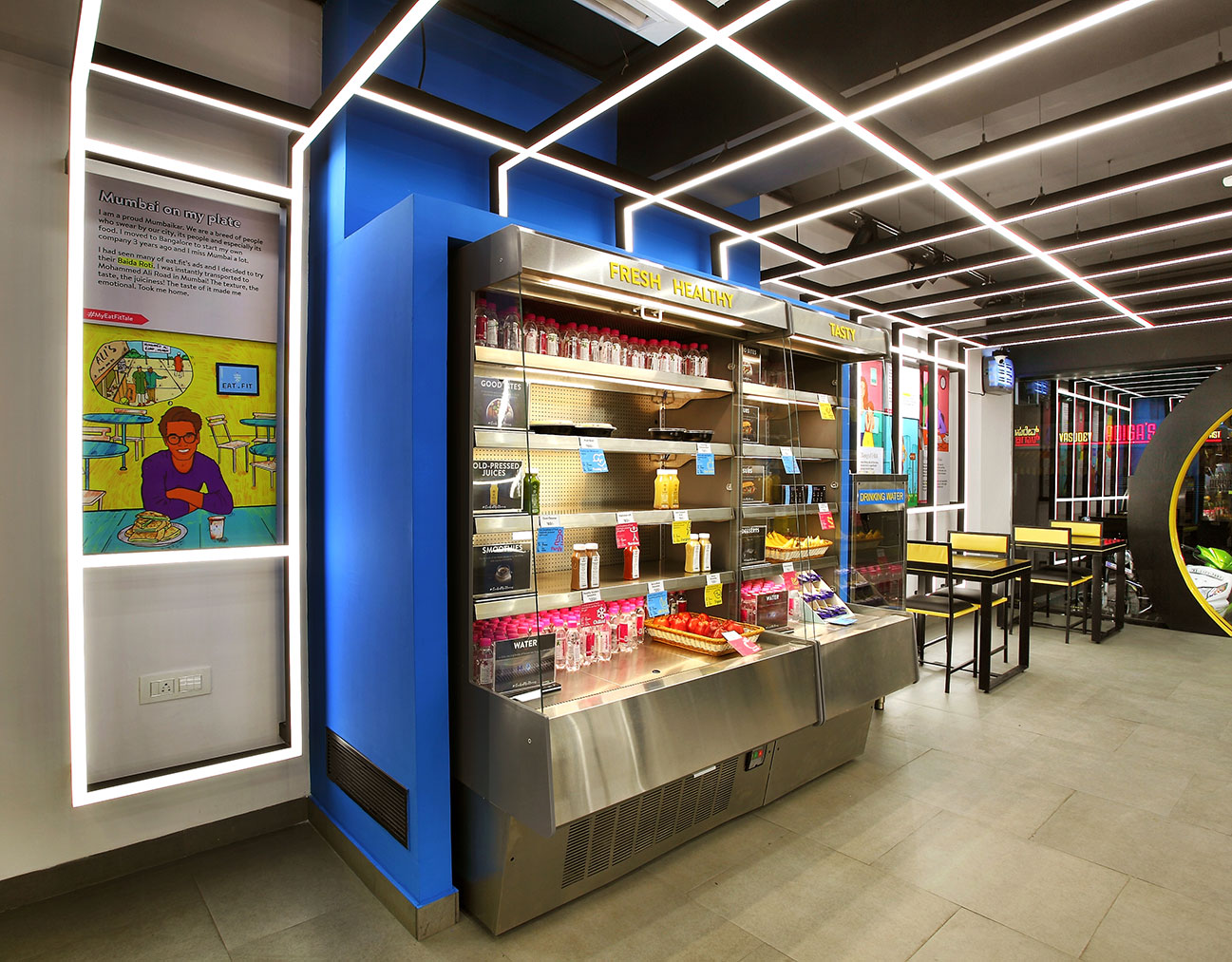
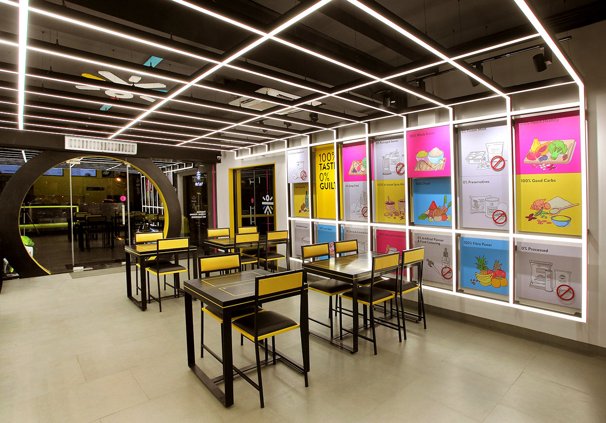
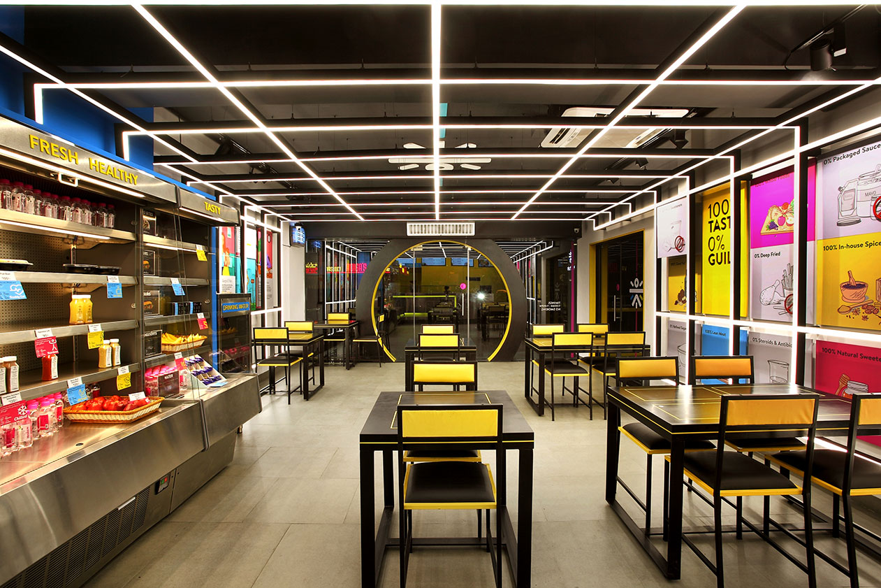
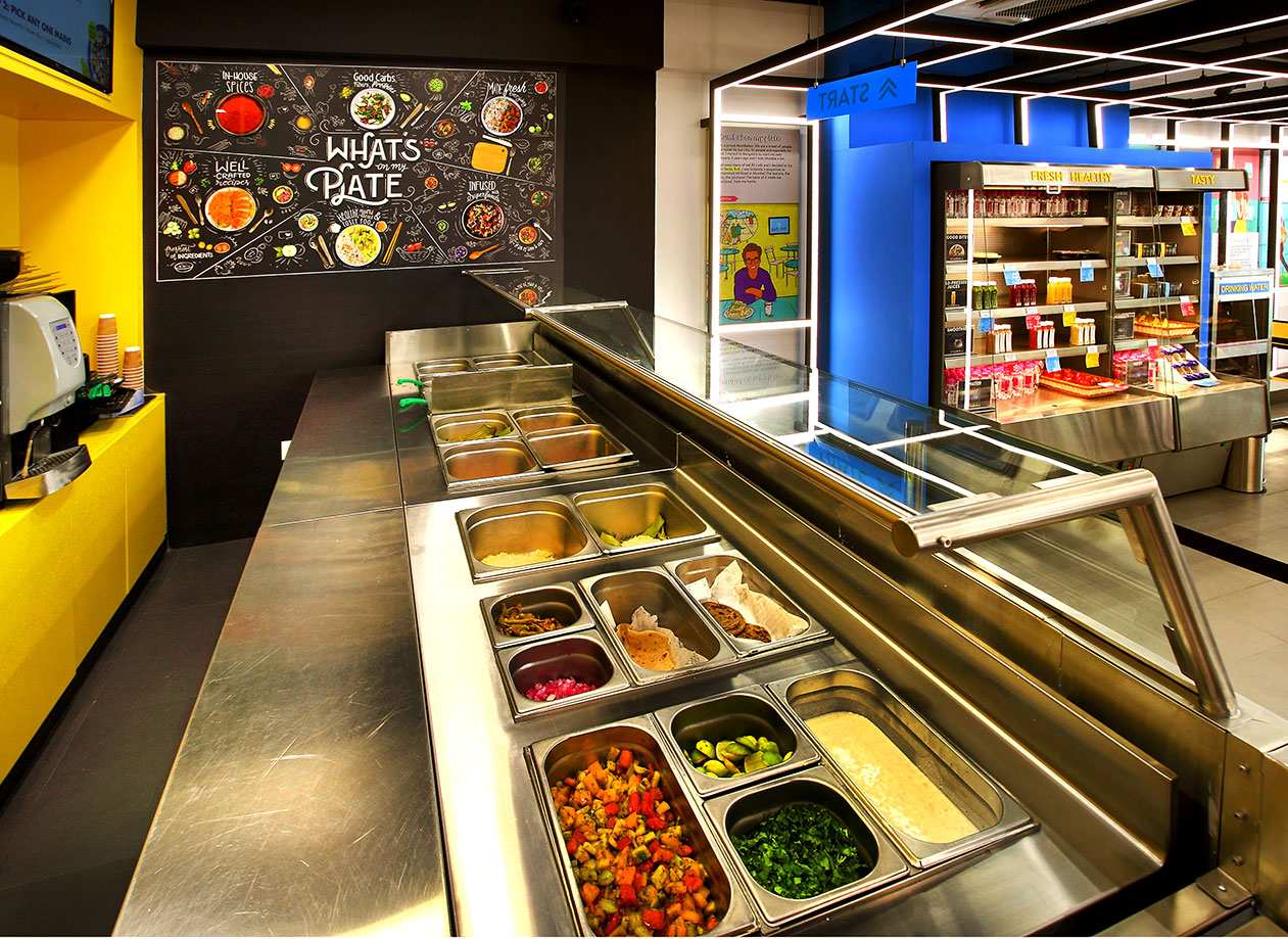
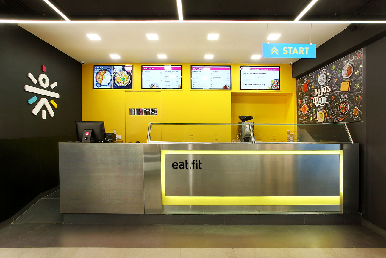
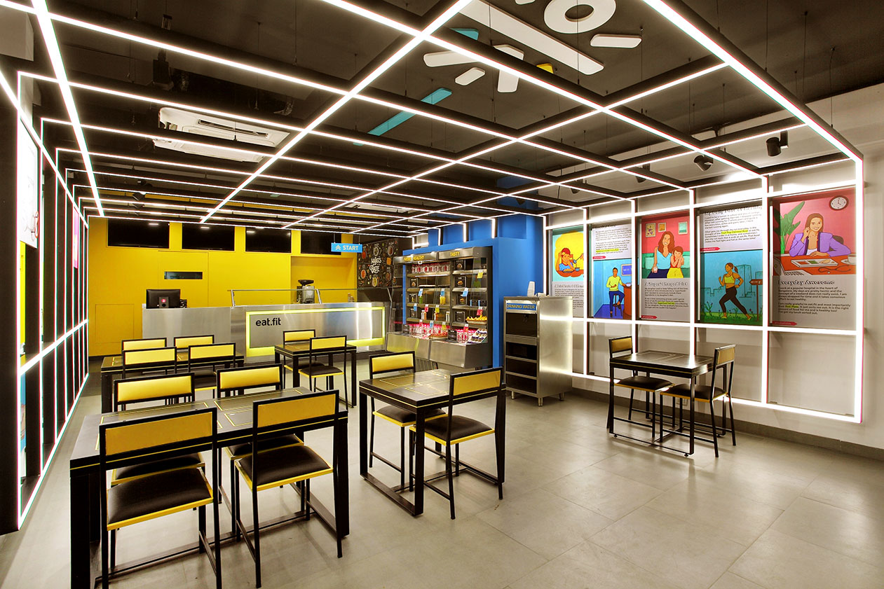
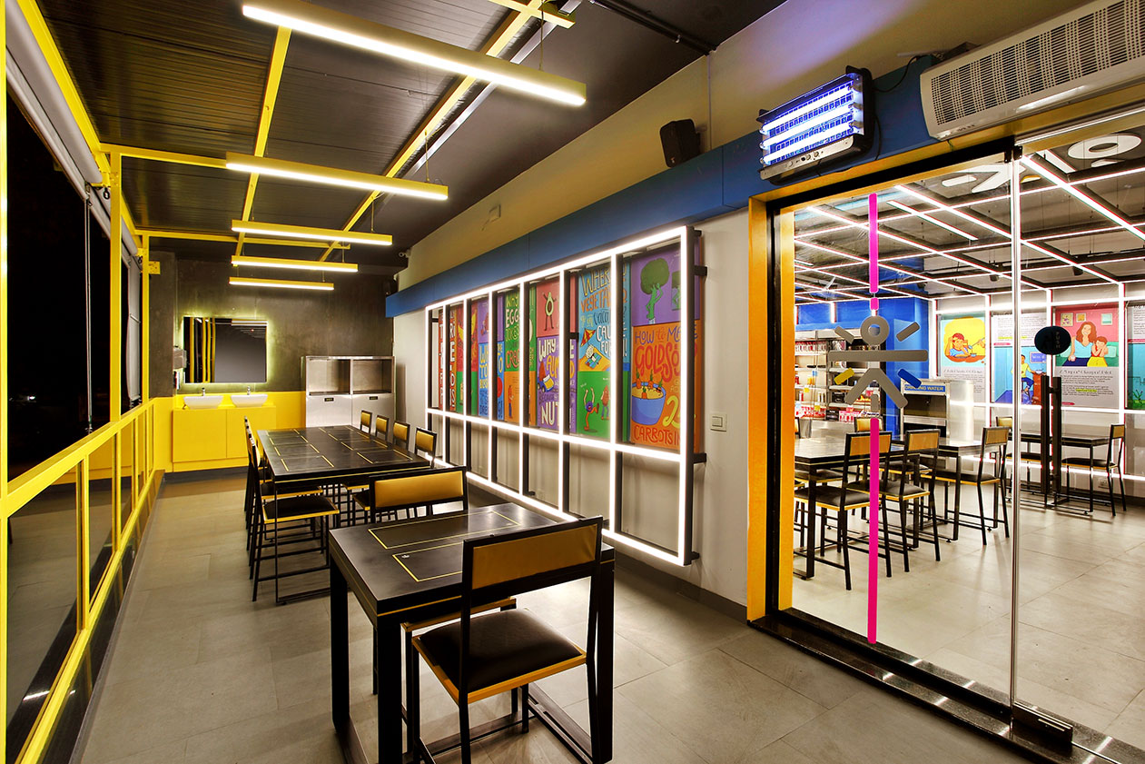
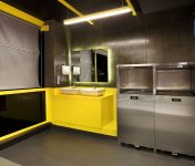
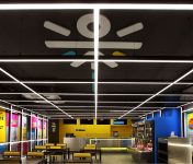
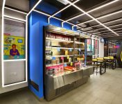
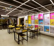
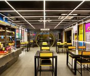
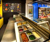
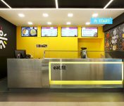
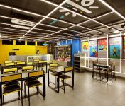
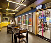
The design strategy was decided to be in the lines of a ‘Futuristic food boutique’. Inspiration was taken from the world of Sci-Fi movies to render the concept in the physical space in the pilot store at Church Street, a popular and happening high street in Bangalore. This was interpreted in the design scheme in its forms, colors and material palette. The design lines are clean and futuristic with highlights in pop brand colors which are in-lit in the floor and the ceiling. A differentiated store front with a ‘spaceship hatch’ inspired door gives a strong visual signature that creates a magnetic curiosity for the target segment to enter the environment. The store is zoned into the pick-up, seating, service and the kitchen. Seating is planned to accommodate pair, small group and community seating at tables and seating that are themed for the concept. Lighting plays a very crucial role in creating the drama in the environment with an innovative combination of liner and accent lights planned from all three dimensions of the space- flooring, walls and the ceiling. Graphics and messaging add the story-telling to the experience with strong quirky visual cues of the brand’s healthy food promise.


