THE BRIEF:
The brief was to expand from the existing Ground floor of the store to a 3 storey complete solutions store for Mobiles, smart phones, Tablets, hand held smart devices and also Personal computers & laptops and surely accessories. This would also include all brands from Apple, Samsung & all other brands giving the ever demanding customer a complete range with best of service.
THE CONCEPT:
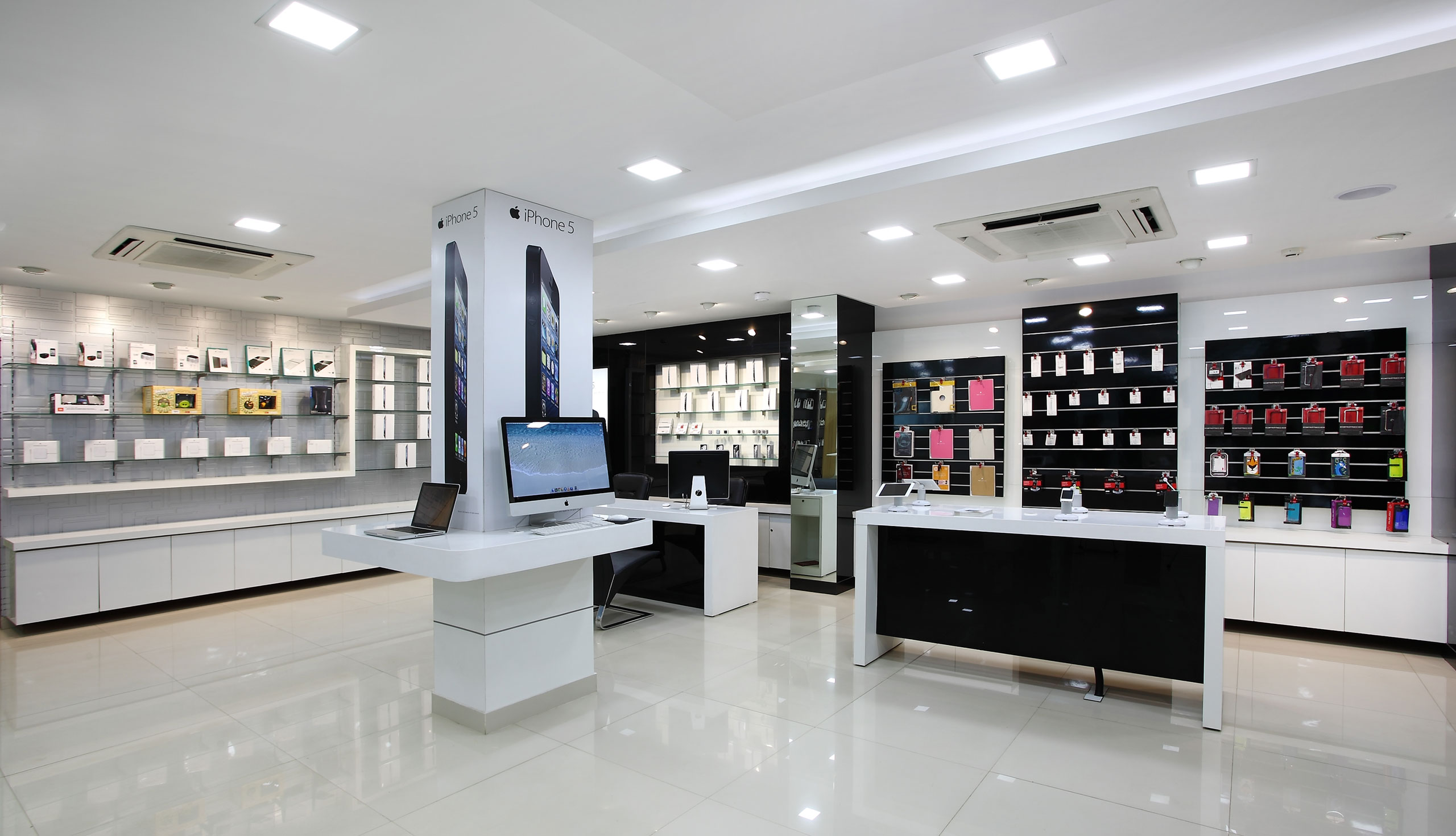
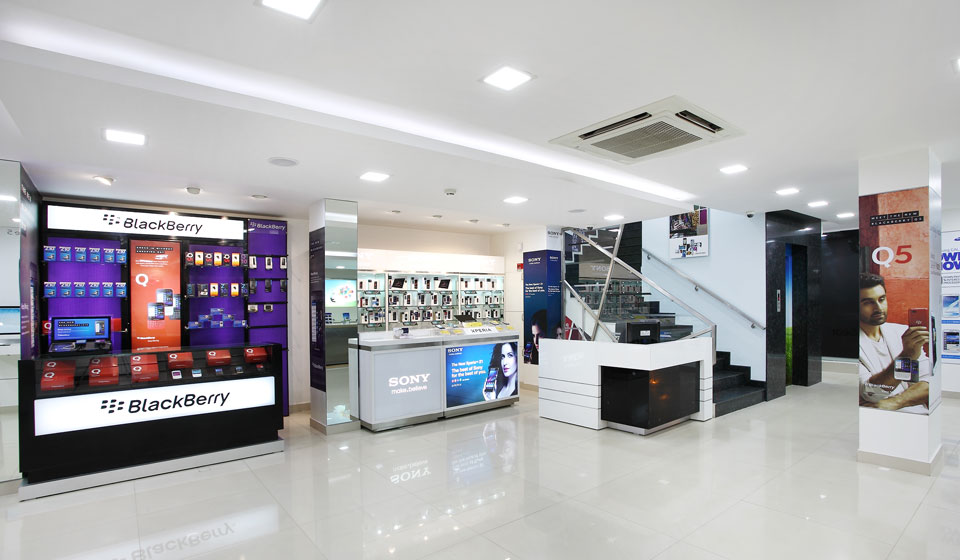
As the store has been stretched to the three floors the challenge is to pull the customers to all the floors was a challenging work.Mobile as a product is highly accessible in all other stores, to make the customer buy from particularly this store is also a challenging.Keeping all these insights we decided to go with clean and contemporary with twist in the approach in the areas like staircase corridors, accessories zones to make it look young and colourful. The signature of the store is white as the base for the interior with light oak finishes on the furniture brings warmth to the ambience.As the building is in the prime location of jayanagar 3rd block, Bangalore and almost being in the corner we treated all floors with open glass windows, to have the store completely visible from Outside and acts as a canvas for the changing visuals and graphics for the technology brands.The Store Interiors has been kept as very contemporary and simple mostly going in line with the current trends globally. Types of material like, steel, acrylic, laminate acrylic solids have been used to bring the harmony in the whole interior.Material has been used differently to get the surprise factor in the store.Some of attitude statement has been incorporated as part of the graphics to bring emotional content.


